

Wayfinding signage design is the disciplined practice of organising information, graphics and physical placement so that people can orientate themselves and move confidently through a space. The goal is simple: reduce confusion at decision points. The single best first step for any UK project is to conduct a decision-point audit, mapping every moment where a user must choose a direction before a single sign is specified.
Before you brief a designer or production partner, work through this quick checklist:
- Identify every decision point in the space (entrances, junctions, lifts, stairs, exits).
- Map the primary user journeys from arrival to each key destination.
- Note where staff interventions or help-desk queries currently cluster — those are your pain points.
- Check which statutory requirements apply (fire, traffic, accessibility) before the design stage begins.
Pro Tip: Brief your wayfinding consultant or production partner with a completed decision-point map. It cuts briefing time significantly and prevents costly scope changes mid-project.
Key takeaways
Effective wayfinding signage design requires a decision-point audit before any design work begins, inclusive design built in from briefing, and a maintenance plan agreed before installation.
| Point | Details |
|---|---|
| Start with a decision-point audit | Map every junction and choice point before specifying a single sign. |
| Apply a clear information hierarchy | Primary destination first, secondary zone or floor, tertiary detail — in that order on every sign. |
| Build inclusive design in from briefing | Retrofitting tactile, contrast and mounting adjustments post-installation costs more and delivers less. |
| Check statutory requirements early | Fire Safety (England) Regulations 2022, Approved Document B and TSRGD apply to many UK projects and must be confirmed at briefing stage. |
| Test with real users before full production | First-time-visitor tests in a pilot area prevent costly rework after the full sign schedule is fabricated. |
| A3m for UK production and installation | A3m handles design verification, in-house fabrication, installation and post-installation maintenance for wayfinding schemes across the UK. |
Table of Contents
- Core principles that make wayfinding signage systems work
- Sign types and the role each plays in a coherent system
- Accessibility and inclusive design: minimum UK expectations
- Key UK regulations and standards every designer must reference
- A practical design process: audit to delivery
- Placement, legibility and material choices that affect performance
- User testing, performance evaluation and maintenance planning
- What to specify for production and installation to avoid delays
- How A3m approaches a wayfinding project from brief to site
- What most wayfinding guides get wrong
- A3m can take your wayfinding project from brief to site
- Sources
Core principles that make wayfinding signage systems work
Effective wayfinding signage design rests on a small number of principles that, when applied consistently, make a space feel intuitive rather than confusing. Network Rail’s wayfinding guidance prescribes a consistent information hierarchy across stations, grouping destinations by direction and sizing text to viewing distance. The same logic applies to any public environment, from a hospital campus to a school.
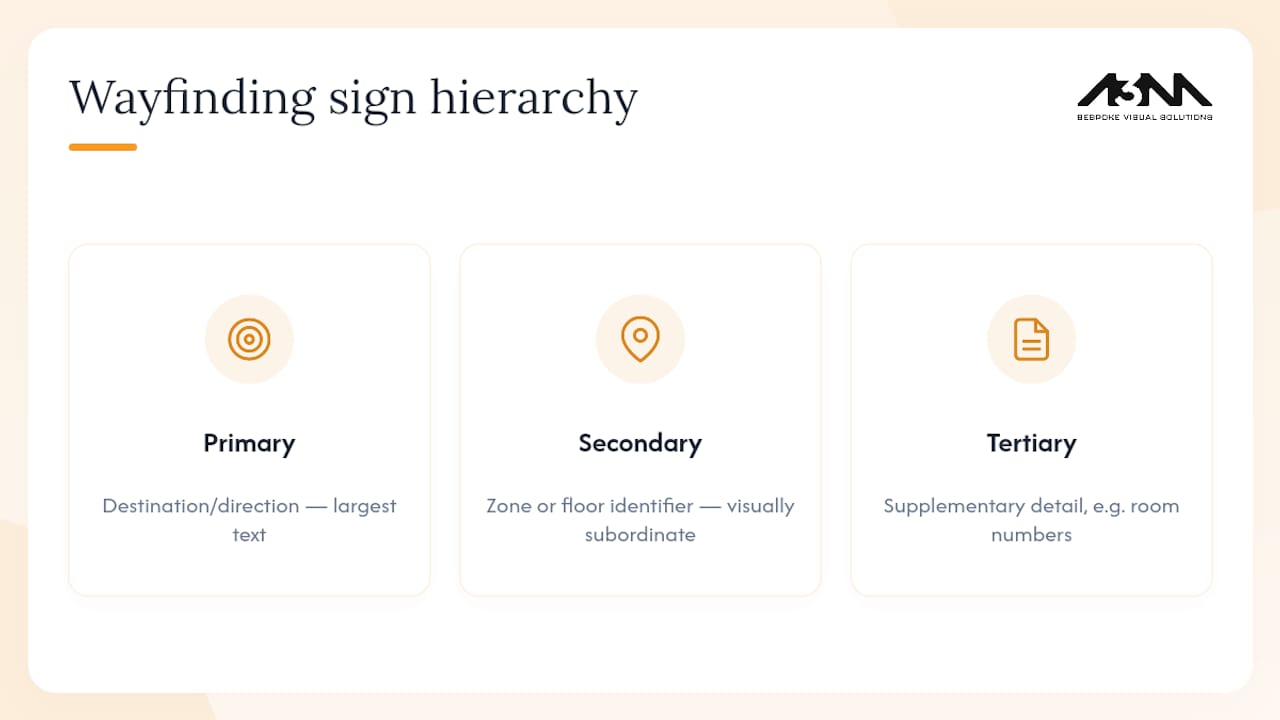
Hierarchy of information is the foundation. Every sign carries primary information (the destination or direction), secondary information (floor or zone identifier) and tertiary information (supplementary detail such as room numbers). Primary information must be the largest, most prominent element. Secondary and tertiary content should be visually subordinate, not competing for attention.
Consistency and predictable placement build user confidence over time. Network Rail’s design manual NR/GN/CIV/300/01 notes that signs mounted perpendicular to the primary flow help users make intuitive decisions at decision points. When signs appear at the same height and position throughout a building or campus, users stop consciously searching for them.
Progressive disclosure is the principle practitioners rely on most. At each decision point, present only the immediate next action and destination. A sign at a main entrance does not need to list every room in the building; it needs to direct users to the correct zone or floor. Overloading a sign with information is one of the most common mistakes in wayfinding projects, and it reliably increases confusion rather than reducing it.
Reduce visual clutter. Group destinations by direction rather than listing them alphabetically. Keep language concise: “Wards A–D” beats “Wards A, B, C and D (Floors 2–5).” Consistent typography and messaging also reduce cognitive load, which Sustrans guidance identifies as a core operational principle that improves first-time success rates.
Pro Tip: Choose a single sans-serif typeface for all wayfinding signs and set a minimum x-height of 15mm for signs read at 5m. Mixing typefaces or using decorative fonts is the fastest way to undermine legibility.
Sign types and the role each plays in a coherent system
A well-designed scheme uses several distinct sign categories, each with a specific job. Mixing their roles, or omitting a category, creates gaps that users fill with guesswork.
- Advance directional signs appear before a decision point, giving users time to prepare their route. Typical locations: corridor junctions, lift lobbies, car park entrances.
- Junction directional signs sit at the decision point itself, confirming the correct turn. These carry the highest information load and must be the clearest signs in the system.
- Confirmatory signs reassure users they are on the correct route after a turn. Often underspecified, they are critical for long corridors and multi-building campuses.
- Identification signs name a space: room numbers, floor plates, building names, entrance markers. They answer “Am I here?” rather than “How do I get there?”
- Regulatory and safety signs carry statutory forms and colours defined by the Health and Safety (Safety Signs and Signals) Regulations 1996, which specify shapes, minimum pictogram simplicity and prescribed colours for prohibitory (red/white), warning (yellow/black) and emergency (green/white) signs. These cannot be redesigned to match a brand palette.
- Maps and orientation totems give users a “you are here” reference. Most useful at main entrances and large junctions; less useful mid-corridor where a directional sign serves better.
- Low-level tactile and braille elements support users with visual impairments. Tactile floor indicators, raised lettering and braille panels are typically integrated into identification signs and maps.
- Digital signs and kiosks allow real-time updates and personalised routing. QR codes on static signs can link to digital pre-visit maps, bridging printed and digital wayfinding. A3m’s digital signs and display solutions cover dynamic content for kiosks and real-time passenger information where the scheme requires it.
For external directional signage, the Traffic Signs Manual Chapter 7 defines directional informatory sign types, colour coding and panel and type sizing rules. Any public realm or transport-adjacent scheme must reference it.
Accessibility and inclusive design: minimum UK expectations
Inclusive design is not an optional layer added at the end of a project. Retrofitting tactile or audio aids after installation is consistently more expensive and less effective than building accessibility into the information architecture from the briefing stage. The Sign Design Guide+ from the Sign Design Society provides practical guidance covering legibility, symbols, tactile information and delivery steps that every designer should consult.
The minimum expectations for UK public environments cover several dimensions:
- Contrast: a minimum 70% luminance contrast between text and background. Matt finishes reduce glare for users with low vision. Avoid glossy laminates on signs that will be read under artificial lighting.
- Type size: large print is defined as a minimum of 16pt (approximately 5.6mm cap height) for close-reading signs such as room name plates. Viewing-distance calculations should govern type size on directional signs.
- Tactile and braille: raised lettering and braille panels are appropriate on identification signs and maps. Braille alone is insufficient; raised text supports a wider range of users with visual impairments.
- Mounting heights: the NHS wayfinding guidance recommends mounting heights and matt finishes that reduce glare, and stresses that pre-visit information must link to on-site signage for first-time visitors. Signs mounted too high exclude wheelchair users and people of shorter stature.
- Audio options: audible information points and talking signs are appropriate in high-traffic public spaces. The Inclusive Mobility guidance from the Department for Transport covers tactile cones at crossings, minimum sign clearances and accessibility features for transport infrastructure.
- Cognitive accessibility: plain language, consistent iconography and short destination names reduce the cognitive load for users with learning disabilities or dementia.
The NHS guidance makes clear that effective wayfinding requires a strategy, not just signs. Pre-visit information, site layout and environmental cues must all work together. For school wayfinding signage in the UK, the same principles apply: school wayfinding design must account for a wide range of users, from young children to visitors unfamiliar with the site, and should integrate with printed and digital pre-visit communications.
Pro Tip: Commission an access audit from an RNIB-affiliated consultant before finalising your sign schedule. It typically costs less than one round of remedial works post-installation.
Key UK regulations and standards every designer must reference
UK wayfinding projects sit within a framework of statutory requirements and authoritative guidance. Some documents are legally binding; others are best practice that courts and inspectors treat as the benchmark. Knowing which is which protects your client and your project.
- Traffic Signs Regulations and General Directions (TSRGD) and Traffic Signs Manual: statutory for highway and public realm signage. Chapter 7 covers directional informatory signs. Use during design and at local authority sign-off.
- Approved Document B (Volume 1, 2019 edition with May 2020 amendments): requires floor identification and flat indicator signs in specified formats for buildings over the defined height, including letter heights and consistent mounting positions between 1.7m and 2.0m. Reference during RIBA Stage 2 and at building control sign-off.
- Fire Safety (England) Regulations 2022, Regulation 8: from 23 January 2023, these Regulations require clear floor and flat identification signage in high-rise residential buildings to assist fire services. Mandatory for all qualifying buildings; check at briefing stage for residential projects.
- Health and Safety (Safety Signs and Signals) Regulations 1996: statutory for all safety signage in workplaces and public buildings. Defines colours, shapes and pictogram requirements. Use when specifying fire, hazard and emergency signs.
- NHS wayfinding guidance (supersedes HTM 65): best practice for healthcare environments. Covers strategy, pre-visit information, sign types and evaluation. Use throughout design and at NHS trust sign-off.
- Network Rail wayfinding guidance: best practice for transport environments, widely adopted in public realm projects. Use for decision-point analysis and information hierarchy.
- Sign Design Society Sign Design Guide+: best practice for inclusive design. Use during briefing and user testing stages.
A practical tip: create a compliance matrix at the start of every project. List each applicable document, the specific clauses relevant to your scheme and the sign-off authority who will check compliance. It prevents late-stage surprises and gives your client a clear audit trail.
A practical design process: audit to delivery
A structured process prevents the most common wayfinding failures: signs specified without user testing, hierarchies that made sense on paper but not on site, and maintenance plans that never materialised. The five stages below reflect how well-run UK schemes are delivered.
-
Decision-point audit and user journey mapping. Walk every primary user journey. Record decision points, current signage, lighting conditions and sightlines. Deliverables: annotated floor plans, a decision-point register and a prioritised list of problem areas. Tools: site photography, CAD overlays, stakeholder interviews.
-
Strategy and information hierarchy. Define naming conventions, zoning logic and the grouping of destinations by direction. This stage produces the information architecture: a master list of every sign, its content, location and sign type. Stakeholder sign-off at this stage prevents content changes during production.
-
Visual design and kit-of-parts. Develop the typography system, iconography, colour palette and sign family templates. Every element should be designed as a system, not as individual signs. For school wayfinding design, the visual language must be legible to children and adults alike, with pictograms supporting text for younger or non-English-speaking users. How visual content supports intuitive navigation is well established: consistent imagery builds user confidence faster than text alone.
-
Prototyping and user testing. Produce physical samples of key sign types and install them in a pilot area. Run first-time-visitor tests: ask participants to complete a timed wayfinding task without assistance. Record decision accuracy, detours and hesitation points. Fold findings back into the sign schedule before full production. Network Rail’s guidance emphasises decision-point analysis and text sizing tied to viewing distances as part of this process.
-
Production, installation and handover. Issue a complete sign schedule with fixing details, finish specifications and electrical requirements for illuminated signs. Agree an installation programme with access and health and safety clearances. Handover documentation should include an asset register, a maintenance schedule and a content update workflow. For multi-site programmes, a retail rollout signage checklist approach keeps sequencing and quality control consistent across locations.
Typical timeline for a medium-complexity public building scheme: 12–20 weeks from briefing to installation. The main cost drivers are fabrication complexity (illuminated versus non-illuminated), electrical installation, access requirements (scaffolding, cherry pickers) and any statutory permits for external signs.
Pro Tip: Lock the information architecture (Stage 2) before any design work begins. Content changes after visual design has started are the single biggest cause of budget overruns in wayfinding projects.
Placement, legibility and material choices that affect performance
Getting the physical specification right is where many otherwise well-designed schemes fail. A sign with excellent content and typography becomes useless if it is mounted at the wrong height, made from a glossy substrate, or fabricated from a material that degrades within two years outdoors.
Mounting heights and placement:
- Standard directional signs are typically mounted at heights comfortable for standing users to view.
- Low-level tactile signs and braille panels should be mounted at heights accessible to wheelchair users.
- Approved Document B specifies floor identification signs mounted at heights suitable for fire service use in qualifying buildings.
- Signs should be perpendicular to the primary flow, not parallel to the wall behind them, so they read naturally as users approach.
Type sizing and legibility:
- A general rule: 1mm of cap height per 1m of viewing distance. A sign read at 10m needs a minimum 10mm cap height; at 20m, 20mm.
- Sans-serif typefaces (such as Johnston, Helvetica, or Frutiger) consistently outperform serif faces for directional signage legibility.
- Avoid all-capitals for long destination names; mixed case is faster to read.
Colour contrast and finishes:
- Minimum 70% luminance contrast between text and background.
- Matt or satin finishes for all internally lit and externally illuminated signs. Gloss finishes above a 30 gloss unit (GU) reading cause reflective glare under artificial lighting, reducing legibility for users with low vision.
- For outdoor signs, UV-stable inks and powder-coated or anodised aluminium substrates offer the best longevity in UK weather conditions.
Material choices:
- Indoor, low-traffic: aluminium composite (Dibond), acrylic, PVC foam board.
- Indoor, high-traffic or vandal-prone: brushed stainless steel, powder-coated aluminium, toughened glass.
- Outdoor: marine-grade aluminium, stainless steel, high-pressure laminate (HPL). For outdoor architectural signage, material selection must account for fixing method, substrate thickness and UV resistance.
- Sustainability: consider recycled aluminium substrates and water-based inks for schemes with environmental commitments.
User testing, performance evaluation and maintenance planning
A wayfinding scheme is not complete at installation. Testing before full rollout and evaluating performance afterwards are what separate schemes that work from those that generate complaints.
Testing methods:
- First-time-visitor test: recruit participants with no prior knowledge of the site. Ask them to navigate from a defined start point to three or four destinations. Record time, errors and verbal hesitations.
- Shadowing: observe real users navigating the space without intervention. Note where they pause, backtrack or ask for help.
- Timed wayfinding tasks: set a target time for each journey based on distance. Compare actual times against the target; significant overruns indicate a sign gap.
- Staff intervention logs: count the number of direction-giving interactions at reception or information points before and after installation. A reduction confirms the scheme is working.
Performance metrics to track post-installation:
- Decision accuracy rate (percentage of users who turn correctly at each decision point).
- Average journey time versus expected journey time.
- Number of staff direction-giving interventions per day.
- Help-desk or complaints log entries related to navigation.
Maintenance checklist:
- Inspect all signs at least annually, and after any building works or layout changes.
- Maintain a live asset register: sign ID, location, content, material, installation date and condition rating.
- Define a content update workflow: who approves changes, who produces replacement panels, and what the turnaround time is.
- Replace damaged or faded signs within an agreed SLA (typically 5–10 working days for critical directional signs).
Pro Tip: Build the maintenance plan into the project contract, not as an afterthought. Agree inspection frequency, update workflows and replacement lead times before installation begins.
The Sign Design Guide+ covers pilot evaluation and how to fold findings back into final sign schedules, making it a useful reference at this stage.
What to specify for production and installation to avoid delays
Incomplete specifications are the primary cause of delays and rework in wayfinding production. Giving your production partner everything they need upfront means accurate pricing, faster turnaround and fewer surprises on site.
Information required for accurate quotes:
- A complete sign schedule: sign ID, location, dimensions, content, material, finish and fixing method for every sign.
- Fixing details: substrate type (plasterboard, masonry, glazing, timber), fixing centres and any structural constraints.
- Finish tolerances: colour references (RAL, Pantone or brand-specific), gloss level, surface texture.
- Electrical requirements: voltage, cable routing and control systems for illuminated or digital signs.
- Any statutory requirements that affect production (AD B letter heights, TSRGD colour specifications).
Site access and installation requirements:
- Confirm access windows with the facilities or site manager before scheduling installation.
- Identify areas requiring scaffolding, mobile elevated work platforms (MEWPs) or out-of-hours access.
- Obtain any necessary permits for external signs (planning permission, listed building consent, highway authority approval).
- Ensure all installation operatives hold relevant CSCS cards and that RAMS (Risk Assessment and Method Statements) are submitted and approved before works begin.
QA on delivery:
- Request digital proofs for all sign content before production begins. Check content, hierarchy, type sizes and colour against the approved sign schedule.
- Agree colour match samples (physical panels) for key sign types before full production run.
- Carry out a pre-installation inspection of delivered signs against the schedule.
- Use a formal installation sign-off sheet: sign ID, location, condition on installation and sign-off signature.
Common pitfalls include missing fixings delivered with signs, incorrect handover documentation and no agreed process for replacing damaged signs post-installation. Address all three in the project contract.
How A3m approaches a wayfinding project from brief to site
A3m works with marketing managers, facilities directors and project teams across the UK to take wayfinding schemes from initial brief through to installed, maintained signage. The process is practical and collaborative, with in-house manufacturing capabilities that give clients direct control over quality, lead times and costs.
A typical A3m wayfinding project follows a clear pipeline:
- Brief and design verification: A3m reviews the client’s sign schedule and design files, checking for production feasibility, statutory compliance (AD B letter heights, TSRGD colour specifications, fire safety sign formats) and material suitability before any fabrication begins.
- Sample production: physical samples of key sign types are produced for client approval before the full production run. This is where colour matches, finish tolerances and fixing details are confirmed.
- In-house fabrication: large format print, cut aluminium, acrylic, brushed steel and composite substrates are all produced in-house, giving A3m control over quality and turnaround. The A3m signage service covers indoor and outdoor fabrication, illuminated signs and bespoke finishes.
- Installation: A3m’s installation teams work to agreed access windows, with full RAMS documentation and site sign-off on completion.
- Post-installation maintenance: clients can agree ongoing maintenance and update services, including an asset register, inspection schedule and replacement panel production.
For accessibility and statutory requirements, A3m’s production team checks sign content against the relevant regulations during the design verification stage, flagging any issues before fabrication. This is particularly valuable for residential developers working under the Fire Safety (England) Regulations 2022 and for healthcare or education clients with NHS or DfT accessibility obligations.
Pro Tip: Share your decision-point audit and information architecture with A3m at briefing stage, not just your design files. It allows the production team to flag practical issues (fixing constraints, viewing distance calculations, material suitability) before they become costly changes.
What most wayfinding guides get wrong
The conventional wisdom in wayfinding is that good design solves the problem. It does not. The most common failure mode on UK projects is not poor typography or wrong colours; it is a sign schedule that was never tested with real users before full production, and a maintenance plan that was never written.
The second most common failure is treating accessibility as a compliance checkbox rather than a design constraint. When inclusive design is integrated from the briefing stage, it improves the scheme for every user, not just those with disabilities. A sign that is legible at 10m in low light, mounted at a height accessible to wheelchair users, with a matt finish that eliminates glare, is simply a better sign. The cost of getting this right at briefing is a fraction of the cost of retrofitting it after installation.
For school wayfinding signage in the UK, the stakes are particularly clear. A school site serves children, parents, visitors, contractors and emergency services, often simultaneously. A scheme that works for a confident adult professional will fail a child, a non-English speaker or a first-time visitor in an emergency. The decision-point audit must account for all of them.
The final lesson: a wayfinding scheme is a living system, not a one-time installation. Buildings change, organisations change, and signs that were accurate on day one become misleading within months if there is no update workflow. The maintenance plan is not an optional extra; it is part of the scheme.
A3m can take your wayfinding project from brief to site
A3m offers a complete wayfinding production service for UK clients: from design verification and statutory compliance checks through to in-house fabrication, installation and post-installation maintenance. Whether you are specifying a new hospital wing, a school campus, a retail estate or a public realm scheme, A3m’s team works with your designers and facilities managers to deliver signs that meet UK regulations, pass accessibility requirements and hold up in the real world.

Our large format print manufacturing capabilities mean we can produce everything from small identification plates to large external totems in-house, with physical samples before full production and a formal installation sign-off process. We also support digital wayfinding integration, including QR-linked content and dynamic kiosk displays. To discuss your project or request a quote, get in touch with the A3m team directly.
Sources
- Wayfinding (supersedes HTM 65 ‘Signs’)
- Approved Document B Volume 1, 2019 edition (May 2020 amendments)
- Fire Safety (England) Regulations 2022 — fact sheet: wayfinding signage (regulation 8)
- The Health and Safety (Safety Signs and Signals) Regulations 1996
- Traffic Signs Manual — Chapter 07 (directional informatory signs)
- Wayfinding (Network Rail)
- Sign Design Guide+ – Sign Design Society