

The single rule that matters most: one hero message, sized large enough to read from arm’s length, placed so it never covers the price rail. Everything else is refinement. A well-designed shelf talker gives shoppers what one field experiment confirms they need most: perceived ease of finding the right product, fast. Signage built on that principle works consistently, whether you print one card or fifteen thousand.
TL;DR:
- Ensuring the hero message is large, readable, and positioned to avoid covering the price rail significantly increases visibility and effectiveness.
- The standard size around three by five inches with a fold tab works well for most situations, but other formats like wobblers and danglers may be needed for specific visibility challenges.
- Copy should be concise with a seven-word headline and a supporting line that adds essential information; CTAs should be specific and aligned with price or product benefits.
- Position shelf talkers at eye level, favor the left side, and never obstruct the price rail or official labels; plain language and clear instructions aid installation.
- Using in-house manufacturing for design and production simplifies adjustments, reduces delays, and improves campaign consistency across multiple retail locations.
Table of Contents
- Quick shelf talker design checklist
- What design rules govern visual hierarchy, typography and colour?
- What sizes and materials work best for shelf talkers?
- How do you write copy that actually converts?
- Where should shelf talkers go on the shelf?
- What should production, quantities and cost look like?
- What do effective shelf talker examples look like?
- How accessible is your shelf talker to every shopper?
- Can QR codes and NFC tags make shelf talkers work harder?
- How do you test whether a shelf talker is actually working?
- Does colour psychology or brand consistency matter more?
- What separates a well-designed talker from a supplier’s brief?
- How can A3m help with your shelf talker programme?
- Sources
Quick shelf talker design checklist
Before artwork goes to print, run it against this list. It works equally well as a supplier brief.
- Headline: seven words maximum, readable from an arm’s length in under a second
- Supporting line: one sentence, no more than 12 to 15 words
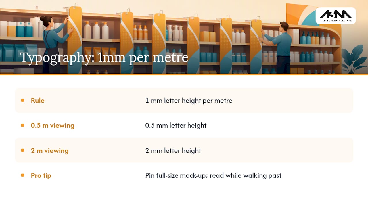
- Typography: apply the 1mm-per-metre rule (a shopper standing 1 metre away needs roughly 10mm cap height minimum, scaling up with distance)
- Hero element: occupies at least 40 to 60% of the panel area
- Contrast: text and background sit at opposite ends of the tonal scale, not just different hues
- Attachment: tab or clip position confirmed against the actual shelf lip, not a generic template
- Preflight: bleed, dieline and colour profile checked before the file leaves your desk
Following this list helps prevent most legibility problems that can occur with in-aisle signage.
What design rules govern visual hierarchy, typography and colour?
A shelf talker has to win a battle it didn’t choose: dozens of competing SKUs, harsh fluorescent lighting, and a shopper who has already decided where to look before they consciously register your sign. Visual hierarchy is how you win that fight.
The hero element, whether that’s a price, a product shot or a single benefit word, needs to dominate the panel. Synthesis of academic and practitioner guidance agrees that a large hero element gets registered in peripheral vision before a shopper consciously looks at it, which is exactly why branding and legal copy belong at the bottom of the visual order, not the top.
Typography follows a simple ratio: roughly 1mm of letter height for every metre of intended viewing distance. A talker read from half a metre needs smaller type than one meant to catch eyes from two metres down the aisle. Below that ratio, text turns into visual noise rather than a message.
Colour contrast does more work than colour choice. A red-on-white promotional talker in a category dominated by red packaging will vanish; a bold black-on-yellow talker in that same category will stand out precisely because it breaks convention. White space isn’t wasted space either. It’s what makes the hero element readable in the first place.
Pro Tip: Print a full-size mock-up and pin it to the shelf edge, then walk past at normal shopping pace. If you can’t read the headline without slowing down, the type is too small.
What sizes and materials work best for shelf talkers?
Most retail categories have settled on a de facto standard: around 3 by 5 inches with a 1 inch fold tab for shelf-edge mounting. That size clears most fixtures without overlapping neighbouring facings, and the fold tab slots into standard shelf-edge channels without extra hardware.
Beyond the standard card, several formats solve specific visibility problems:
- Perpendicular flags: catch the eye from across the aisle, best for high-traffic end caps
- Wobblers: spring-mounted movement draws attention in low-footfall zones but adds production complexity
- Danglers: hang above eye line, useful where shelf-edge space is already crowded
- Dump bin toppers: sit above bulk display bins and need a stiffer stock to survive handling
For a short promotional burst, uncoated card is cheap and perfectly adequate. For anything running longer than a few weeks, or sitting in a chilled aisle, laminated or rigid plastic substrates resist the condensation and repeated handling that turn card stock soft within days.
How do you write copy that actually converts?
Shopper research consistently comes back to the same finding: a talker works because it answers the question already forming in the shopper’s head, not because it shouts louder than the shelf next to it. Practical retail guidance recommends headlines of seven words or fewer, tested against a genuine arm’s-length, one-second glance.
Supporting lines earn their place only if they add a fact the headline couldn’t carry: a certification, a use case, a limited-time detail. One sentence, never two.
CTAs that consistently work include:
- Price-anchored: “Save £2 this week”
- Novelty-driven: “New recipe, same shelf”
- Social proof: “Shoppers’ pick this month”
- Digital bridge: “Scan for the full story”
Keep price claims and any regulated copy (allergen statements, “was/now” pricing) consistent with what’s on the shelf edge label. A talker that contradicts the official price tag gets pulled by store staff faster than any design flaw would.
Where should shelf talkers go on the shelf?
Placement decides whether a well-designed talker gets seen or gets removed by a frustrated store manager.
- Match eye level where possible. Shoppers scan roughly waist to eye height first; low shelves need a slightly larger hero element to compensate for the downward glance.
- Favour the left side of the facing. English-reading shoppers scan left to right, so a talker on the left edge of a product block gets registered earlier in that scan.
- Never cover the retailer’s price rail. This is the single fastest way to get signage stripped from a shelf within a day of installation.
- Leave clearance around barcodes and shelf labels. Retailer removal patterns show that signage obstructing official pricing gets taken down regardless of how well it’s designed.
- Write the installation brief in plain language. Store teams installing dozens of talkers per visit need a one-line instruction per SKU, not a design rationale.
What should production, quantities and cost look like?
Per-unit costs scale with format and run size. A standard card-stock talker printed in bulk costs a fraction of a die-cut, laminated equivalent produced in a short run, so match the finish to the campaign length rather than defaulting to the most durable option everywhere.
A sensible starting order is 1.5 to 2 units per door, which covers the original install plus a fast replacement when one gets damaged or removed. That single margin has saved more field visits than any other production decision worth making before the print run goes to press.
- Choose durable plastic or laminated card for campaigns running longer than four to six weeks
- Choose lighter card stock for short, high-volume promotional bursts
- Pre-approve artwork with category managers before printing to avoid a wasted run
- Pack talkers flat, in SKU-labelled batches, to speed up in-store installation
Practical supplier guidance on ordering extras and pre-approving designs consistently reduces mid-campaign reprints, which is where most unplanned budget disappears.
What do effective shelf talker examples look like?
Emotion-led categories (confectionery, gifting, seasonal lines) respond to short, feeling-driven headlines. Functional categories (household, pharmacy, DIY) respond better to a clear benefit stated plainly.
Three templates worth adapting:
- Emotion-led: Headline “Treat yourself today” / Supporting line “Small batch, big flavour” / CTA “Try it now” / Finish: gloss laminate
- Functional: Headline “Lasts twice as long” / Supporting line “Independently tested formula” / CTA “Compare and save” / Finish: matte card
- Digital bridge: Headline “See it in action” / Supporting line “Scan for a 30 second demo” / CTA “Scan here” / Finish: rigid plastic
Die-cut shapes, a bottle silhouette, a leaf, a speech bubble, break up shelf monotony instantly, but test the attachment point under real packing conditions before committing to a full production run. A pilot in a handful of stores, tracked through sales lift or QR scan volume, tells you more in two weeks than any design meeting will.
How accessible is your shelf talker to every shopper?
Accessibility in shelf talker design isn’t a niche concern; it decides whether a meaningful share of shoppers can read your message at all. Low vision, colour blindness and simple age-related sight changes all affect how a talker performs in the aisle, and none of them are solved by making text merely “big enough.”
Contrast is the biggest lever. A pale grey headline on a white background might look elegant on screen, but it fails for anyone with reduced contrast sensitivity, a group that grows substantially with age. Stick to genuinely dark text on genuinely light backgrounds, or the reverse, rather than trendy mid-tone pairings.
Colour choice needs a second check beyond aesthetics: red-green colour blindness affects a meaningful proportion of men, so a talker that relies purely on a red versus green colour cue to communicate “sale” versus “new” will simply fail for those shoppers. Pair colour with a shape, icon or word every time.
Font choice matters more than most retailers assume. Condensed, heavily stylised display fonts might suit a brand mood board, but they slow reading speed for anyone with dyslexia or low vision. A clean, moderately weighted sans serif at the correct size, per the 1mm-per-metre rule, does more accessibility work than any other single decision.
Finally, keep critical information (price, allergen note, offer end date) out of decorative elements like ribbons or starbursts where type often shrinks below a readable size. If it matters, it needs its own clear line.

Can QR codes and NFC tags make shelf talkers work harder?
A shelf talker’s job used to end at the shelf edge. It doesn’t have to anymore. QR codes and NFC tags turn a static card into a doorway to video demos, recipe content, loyalty sign-up or a full ingredient list that would never fit on a 3 by 5 inch panel.
The design discipline here is restraint. Cramming a code into a corner alongside three other design elements is the most common reason scan rates disappoint.
The CTA line matters just as much as the code itself. “Scan for a recipe” outperforms a bare code with no explanation, because shoppers need a reason before they’ll reach for their phone mid-shop. Keep the promise specific: “Scan for a 30 second demo” sets an expectation that a generic “scan here” doesn’t.
NFC tags work well for categories where shoppers already expect a tap-to-learn experience, premium spirits, cosmetics, electronics, but they add cost and require a compatible phone, so they suit higher-margin categories better than everyday grocery lines. QR remains the more universal choice for now.
Whichever technology you choose, the underlying rule doesn’t change: the printed message has to work perfectly on its own. Digital integration should add value for shoppers who go further, never rescue a talker that fails to communicate at a glance.
How do you test whether a shelf talker is actually working?
Design opinions are cheap; sales data isn’t. The most reliable way to know whether a shelf talker design works is to pilot it in a small set of stores before committing to a full rollout, then track it against simple, comparable KPIs.
Sales lift on the marked SKU, measured against a matched control store without the talker, is the clearest signal. QR or NFC scan volume, where digital elements are present, offers a second, faster-arriving metric that doesn’t wait for weekly sales reports to catch up. Retake or removal rate, how often store staff pull a talker before the campaign ends, is an underused but honest indicator that something about placement or copy is causing friction on the shop floor.
A/B testing works well at the format level too. Running two headline variants, or two colour treatments, across a matched set of stores tells you far more than a design committee vote ever will. It’s the same logic the in-store display research applies at category level: signage effects vary by category and by promotion type, so what works for a private-label snack won’t necessarily work for a premium spirit.
Keep the test simple. Two or three variants, a fixed test window (two to four weeks is usually enough to smooth out day-of-week noise), and one clear metric per test. Complexity kills most in-store testing programmes before they produce a usable answer.
Does colour psychology or brand consistency matter more?
Both matter, but they answer different questions, and confusing them is where a lot of shelf talker design goes wrong.
Colour psychology governs whether a shopper notices and correctly interprets your talker in the first half-second of a glance. Red genuinely does read as urgency and discount across most Western retail contexts; green reads as natural, organic or eco-friendly; black and gold read as premium. These associations are strong enough that fighting them without a good reason usually costs you attention rather than earning it.
Brand consistency, keeping your logo, brand colours and typeface aligned with packaging and other in-store signage, matters for a completely different reason: it builds recognition over repeated exposures, not within a single glance. A shopper who sees a consistent visual identity across shelf talker, end cap and till-point display trusts the promotion more than one that looks like it was designed by three different people.
The tension between the two shows up constantly. A brand’s signature colour might be a soft pastel that performs poorly for a “sale” message needing urgency. The right call, more often than not, is to let the category-appropriate psychology lead the hero element and the CTA, while keeping brand colours present but secondary, in a logo strip, a border, or a supporting line. Consistent visual storytelling across touchpoints builds trust over time; a single shelf talker’s job is to win the next three seconds. Design for both, but never sacrifice the second to protect the first.
What separates a well-designed talker from a supplier’s brief?
Design rules only survive contact with a real shelf if the production brief matches them. Getting that brief right is a large part of what a production partner does for retailers running multi-site campaigns.
A workable supplier brief covers bleed and dieline dimensions matched to the exact fixture, not a generic template; a clearly marked attachment or fold-tab zone; confirmed colour profile for the print method; and packing instructions that keep SKU batches separate for fast in-store installation. Skip any one of these and the gap shows up on the shop floor, not in the design file.
This process is run daily across retail, hospitality and multi-site rollouts, with in-house manufacturing that keeps proofing, die-cutting and finishing under one roof rather than split across several suppliers.
— Steve
How can A3m help with your shelf talker programme?
Choosing a production partner where design, die-cutting and finishing all happen under one roof means a fold-tab dieline, a laminate upgrade or a last-minute quantity change doesn’t mean starting a new conversation with a new vendor.

That matters most once a talker design leaves the concept stage and needs to survive a real production run across multiple sites. Short-run DIY print works fine for a single-store test; once you’re briefing dozens of doors with mixed formats, durable finishes and tight installation windows, a production partner with in-house manufacturing removes the back-and-forth that eats into campaign timelines. Some production partners support multi-site fulfilment through web-to-print portals, so repeat orders and store-specific quantities don’t need a fresh brief every time.
If you’re planning a rollout, get in touch about a proof or template to see how your design holds up in production before you commit to a full print run.
Sources
- Effect of shelf talker flags on consumer shopping behaviour (field experiment)
- Effects of in‑store displays and promotions on PL vs NB (Journal of Retailing and Consumer Services, 2023)
- Shelf talkers that drive impulse buys and educate shoppers — Opener blog
- What is a shelf talker? The complete guide for retail | ShelfTalkerApp